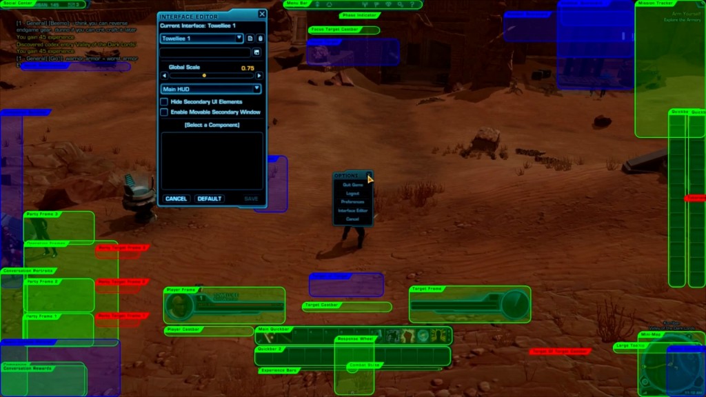
Towelliee checks out the new changes to the Star Wars: The Old Republic user interface system on the public test server. Towelliee was pleased to see the Target of Target in effect as well as other new options. Many much needed improvements have been made to Star Wars: The Old Republic to bring many aspects of the game up to industry standards to compete with other major titles such as World of Warcraft. Many core features that were absent from Star Wars are available now in patch 1.2. Bioware has invested a tremendous amount of time and effort into listening to player and community concerns in order to produce a patch that addresses many of the more glaring problems.
Massively provides additional information about the new UI system for Star Wars: The Old Republic: http://massively.joystiq.com/2012/03/20/hyperspace-beacon-gooey-gui/ As far back as my interview with Blaine Christine at PAX 2010, I have been concerned with the user interface of Star Wars: The Old Republic. Although the question did make it into that article way back when, I did ask him about the UI because at that time, it was mostly black and rather clunky. We knew that incarnation would not be the final product. Animations were being touted as innovative at the time; I had asked about the UI’s drawing the player’s attention to the center of the screen because that’s where the action was happening. Of course, he answered that the ultimate goal with the UI was to enhance the player’s overall experience. That’s what all UIs should do, right? One the sticking-points during my beta impressions centered around my having to stare at my UI as I waited for cooldowns. I know that it’s not a new thing for MMOs. In fact, nearly every MMO I can think of has some sort of abilities that require cooldown. Generally speaking, I am OK with having to look at the UI for those cooldowns. However, the positioning of SWTOR‘s UI really drew my attention away from what was happening on the main part of the screen. Exactly three months after release, I have become comfortable with how the Star Wars whack-a-mole works, but with the changes in Update 1.2, I can dream of something better…
After the long introductory cinematic, you are dropped in front of a UI that looks very similar to the current interface on live servers. A single button bar sits at the bottom with your player frame and target frame on top of it. The chat window still rests in its unusual upper-left-hand corner, and the radar and mission tracker are on the right. Hitting Escape brings up the main game menu; from there, you can click on the interface editor. At that point, your screen becomes a hodgepodge of red, green, and blue boxes with the interface editor in the middle. As I mentioned last week, the editor reminds me a lot of RIFT‘s editor, one that I admire a lot. Primary elements are in green, indicating that these will show up on your screen nearly all the time (party frames and cast bars being a couple of exceptions). Blue boxes are secondary elements, meaning they pop up under only very specific circumstances, like the Huttball scoreboard. And lastly, the disabled elements are in red. As in most robust UI editors, the elements are scalable, are mobile, and have adjustable opacity. Globally, the elements can be scaled; however, at this time opacity is only adjustable individually. I asked DesignerEmmanuel Lusinchi about adding a global opacity adjustment at the Guild Summit. He said that he would look into it. You can also save your UI settings and use them for your other characters or under specific circumstances. In my case, I have one for combat and one for roleplay. Don’t judge me! As veteran MMO players, you can take comfort in the default saved interface called Retro. This interface should be familiar because it’s just like WoW. Before I get comments that other games like EverQuestand Asheron’s Call used a similar interface, I’ll state that World of Warcraft happens to be the most familiar. In fact, the majority of comments in general chat suggest that people use the Retro interface because of how similar it is to WoW. That said, the interface follows the standard quickbars at the bottom, player and target frames at the top-left, chat box at the bottom-left, and map on the upper-right.
First, I started with the quickbars. These are the most important during combat. Because of the number of different cooldowns and reactive abilities, I have to be able to see the buttons as action happens in the middle. The default position at the bottom-center requires that my eyes move away from my character, if only for a moment. If I move the quickbars just above true center, then that allows me to see both the quickbar and my target at the same time. What about the issue of seeing enemies? Since I tab target most of the time, I don’t need to be able to click on enemies, so I adjust the opacity to 40%. This allows me to see through the quickbars and see the cooldowns at the same time. The next part was a bit tricky, and to be honest, I’m still futzing around with it. The player frame and target frame need to be visible as well. But I do like playing a healer, and having party frames be easily accessible helps as well. Initially, I set the player frame and target frame just below center, which worked. I could easily see what was happening to both myself and the target. However, in my first group encounter, I would have to turn my head and move my mouse quite a distance in order to select the tank’s target. That’s when I decided to move the player and target frames to the top center and the party frames to the lower center. It still requires some tweaking, but I believe I’ve finally settled on the general premise. Check out the image below and tell me what you think! I’ve also included a short video at the end showing how I came up with this layout. How many of you have had a chance to jump over to the PTS? It’s a pretty big download, so I understand if you have not. However, if you have a chance, I definitely recommend it. It will give you a chance to customize your GUI the way you like it. I know many of you have some interesting philosophies behind UI design. How do you go about it? An MMO interface is a lot like a player’s signature: Everyone’s is slightly different. You can also tell where people have been in the gaming world by the way they lay out their UIs. Some of my first online games were shooters, so you might notice that I like to have my minimap in the center. What does your UI say about you and your playstyle? Let me know in the comments, and I will see you next week. Additional content from Towellie! http://twitch.tv/towelliee |


